

IDENTITY / ICON SYSTEM / V1.1 · WORKING REVIEW
Small shapes.
Big kid energy.
A familiar sport. A little encouragement. A clear next step. One family of crisp, simple symbols for the whole camp experience.


01 / SKILLS THROUGH PRACTICE AND PLAY
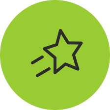
A star, with a
little momentum.
The star already belongs to the JKSC graphic language. Two short motion strokes give it a sense of practice and play, without tying the message to one sport.
ILLUSTRATIVE WEBSITE PLACEMENT
Skills Through Practice and Play
Coaching, games and movement help kids build skills while having fun.
Working review artwork. These previews do not change the live camp website.
02 / THE SPORTS FAMILY
Recognizable.
All on the same team.
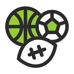
Keep the familiar equipment from the current site. Give every icon the same line weight, deliberate details and a consistent amount of breathing room.

Multi-Sport
Pickleball
Basketball

Baseball
Soccer

Football

Softball

All Sports
A preview of the eight current sport/navigation labels. Selected cards use the charcoal version on lime. Keep sport names visible. The All Sports collection means “browse every sport.” Its separated equipment distinguishes the index from the overlapping Multi-Sport cluster.
03 / THE COMPLETE LIBRARY
Pick the right signal.
Sports, camp experiences and everyday website needs. Search, switch color treatments and inspect each symbol at its real display size.












































No matching icons. Try another word or reset the filters.
Volleyball and Track & Field are expansion artwork. Their inclusion does not announce a current camp offering. The Simple star is an alternative to Skills in motion.
04 / KEEP THE FAMILY TOGETHER
Simple rules.
Consistent results.
One drawing language
Clean contours, open interiors and a restrained lime accent. Keep every icon proportional and preserve its full square canvas. All Sports uses lighter 2-unit internal details so the small equipment stays clear.
Size for the detail
Start at 48 px in sport cards and 32 px in feature badges. Multi-Sport, Softball and All Sports need at least 40 px. Site essentials and the simple star can go to 24 px.
Let the label do its job
Pair icons with visible text. Keep at least 8 px between icon and wording. Use a 44 px or larger clickable area even when the symbol inside it is smaller.
Support the identity
The JK mark and full-name logos identify the camp. Icons identify activities, ideas and actions. Use the supplied logo masters for brand signatures.


Keep the artwork clean.
Use SVGs on the web where supported. Use the transparent PNGs in email and image-based editors. Avoid screenshots, fuzzy enlargement, shadows, gradients and added texture.
The 256 px PNGs support up to a 128 px display at 2× resolution. The SVGs scale without pixel blur. Transparent outer canvases may contain deliberate white interior fills in the brand treatment.
Make the meaning accessible.
Keep sport names and useful action labels visible. Beside a matching heading, the icon can be decorative. An icon-only button needs a meaningful accessible name. Never rely on lime alone to communicate a state.
White artwork belongs on charcoal. Lime alone has low contrast on white, so meaningful shapes retain a charcoal outline. Check each final placement at its actual size.
Artwork source and production notes
Original SVG geometry created for JKSC with AI-assisted vector authoring. The star contour is adapted from the existing brand-guide star. The files use explicit paths and shapes, with no generated bitmap textures or third-party icon pack.
The set is a working review edition. Final design approval and installation on the camp website are separate steps. The download includes editable SVGs, PNG exports, a one-color sprite, an asset index and usage notes.
05 / TAKE THE SYSTEM WITH YOU
Ready for the next use.
Complete icon pack
32 icons, three color treatments, SVGs, PNGs and both feature badges.
Updated brand book
The existing guide plus the new icon chapter and placement examples.
Icon system v1.1 / Brand guide v1.6 / Working review / November 2, 2026