Jordan Kent’s Just Kids Skill Camps

BRAND BOOK / 2027 / V1.6 · WORKING REVIEW

Made for
kid energy.

A place to try.
A moment to connect.
Room to be yourself.

Read the guide
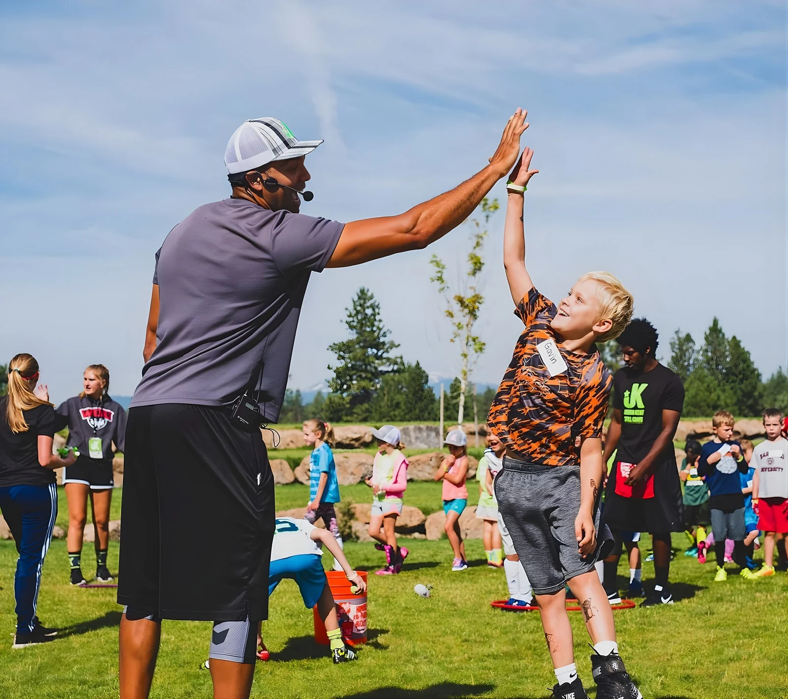
A camper reaches up to high-five Jordan Kent.
Real encouragement. Real camp.
Jordan Kent’s Just Kids Skill CampsSince 20122027 edition · Updated November 2, 2026

01 / The foundation

Let kids be kids.

Approachable and inclusive. The camp experience comes first. Every design choice should help people feel it.

Bright, fun, clean athletic energy. Real camp moments, confident typography and a little lime. Every piece should make it easier to picture a kid trying something new, finding a friend and feeling like they belong.

01

Kids lead.

Show the experience through the kids. Make expressions, action and connection the first thing people notice.

02

Give it room.

Use confident type and purposeful space. A bright composition can be filled with photography. White space should support the moment, never make it feel distant.

03

Energy, with control.

Use one clear graphic idea at a time. Keep lime recognizable, layouts readable and the camp experience in focus.

02 / IDENTITY

The right shape.
The same camp.

A broad logo family for real placements, with new compact and square options to compare.

Restored Vector
Restored Vector

The full-name starting point.

Small Spacing
Small Spacing

A tighter horizontal relationship.

Compact with founder

The supplied v1 compact master.

Horizontal 4:1
Horizontal 4:1

Headers and narrow canvases.

Square with founder
Square with founder

The supplied v1 square master.

JK symbol
JK symbol

Small spaces with brand context.

More formats. One identity.

All 13 original arrangements remain available. Choose by space and use: wide headers, a compact signature, a square or vertical canvas, or a small JK symbol. Proportional artwork stays intact across the family.

Browse all 13 arrangements and the new options →

A little more room for the name.

Three new options to compare. The balanced square reduces the symbol’s dominance. Two founder-free alternatives keep the original Just Kids Skill Camps lettering. These are supplied review options, not instructions to alter another logo.

Review optionSquare, rebalancedSquare, rebalanced

Founder retained. More presence for the whole name.

SVG master ↓
Review optionCompact, no founderCompact, no founder

A shorter name stack with the same outlined lettering.

SVG master ↓
Review optionSquare, no founderSquare, no founder
A square signature with a simpler name hierarchy.

SVG master ↓

At the size people see.

Start review at 160 px wide for the original Compact, 190 px for the original Square, and 32 px for JK. New options: 180 px for the balanced square, 120 px for either founder-free option.

These are review starting points, not guaranteed minimums. Check the final display, crop, background and production process. Use JK if the name becomes too small to read.

Give the logo space.

JK symbol with a marked clear-space boundary
Clear space ≥ ¼ of the JK symbol height

Measure from visible artwork. Supplied canvas padding does not replace clear space. Use the circle-safe JK for circular profile crops.

Name it clearly.

Formal introduction: Jordan Kent’s Just Kids Skill Camps. Everyday copy: Just Kids Skill Camps. Use JKSC once the name is established.

When JK appears alone for an unfamiliar audience, place the full camp name in readable nearby copy.

Use a supplied master.

Scale proportionally. Do not retype the logo, stretch letters, recolor the lime by eye, or move the founder line inside a supplied arrangement. Choose the founder-free file when that is the intended treatment.

02B / ICON SYSTEM

Small shapes.
Big kid energy.

A consistent family for sports, camp experiences and the everyday details that help families find their way.

32 vector symbols with shared line weights, the exact brand lime and clear color treatments. Includes the Skills in motion star, all eight current sport/navigation labels, site essentials and two expansion sports.

Explore the icon system →

Working review artwork. The camp website is unchanged by these previews.

03 / Color

A little lime goes a long way.

White is the first choice for large surfaces. Charcoal grounds the message. Lime makes it unmistakably JKSC.

WhitePrimary canvas and breathing room
Brand limeSignature brand accent and selected graphic fields
CharcoalPrimary text, buttons and limited contrasting panels
SlateStandard logo lettering and secondary dark surface
BlackOne-color reproduction and maximum contrast

Select a hex value to copy it. Brand lime is always #99CC33, including the logo.

Optional campaign accents.

These are not main brand colors. Pink, orange and blue provide design breadth outside the everyday system. Choose one when the message benefits from it. Keep brand lime recognizable and never substitute an accent into the logo.

Pink#FF66C4
Orange#F95C04
Blue#00AEFF

Email purchase actions: use blue #00AEFF with black text for purchase and registration buttons in email. Informational actions, such as “View camp details,” can stay lime. This email rule does not change CTA colors in ads or on the website.

Charcoal on lime.

Clear, energetic and readable. Use this pairing for text on a lime surface.

7.44:1 contrast

White on charcoal.

Strong contrast for a button or selected panel. Keep the overall composition bright.

14.16:1 contrast

White on lime is only 1.90:1. Do not use it for meaningful text. Use charcoal or black on pink (5.36:1 and 7.95:1). White on pink is only 2.64:1; normal-size slate is 4.12:1. Use black text on orange and blue. For print, confirm the color match on the actual stock and process.

04 / Typography

Confident type. Human energy.

One everyday pairing, with an occasional expressive accent.

Outfit / 800
Gofor it.

Confident and friendly. Use Outfit 700 for guide headings and 800 for short, expressive display messages. Give the letters room. Keep line breaks deliberate and avoid tight tracking that closes the spaces between characters.

Outfit source and license
DM Sans / 400, 600, 700

Sports. Friends.
Room to be yourself.

DM Sans carries body copy, labels, buttons and supporting information. Use 700 for compact email and ad headlines, 600 for live email headings, and 400 for body copy. Its clear letterforms keep practical messages readable at small sizes.

DM Sans source and license
Guide heading

40 px
Outfit 700 · line height 1.05

Section heading

32 px
Outfit 700 · line height 1.1

Live email heading

28 px
DM Sans 600 · line height 1.15

Body

18 px
DM Sans 400 · line height 1.5

FatFrank stays in the mix.

Keep FatFrank as an optional expressive headline voice. It is useful for short, playful campaign moments. Outfit and DM Sans remain the everyday system. Use one headline family within a composition.

What needs a license?

Outfit + DM Sans: free for commercial work under the SIL Open Font License. Keep their license files when redistributing the font files.

FatFrank: commercial font, also available through Adobe Fonts. An existing Adobe entitlement may cover finished graphics and embedded PDFs. Editable text needs licensed access. A desktop license does not automatically cover custom Canva uploads or self-hosted webfonts. Do not distribute FatFrank font files in the library.

Adobe Fonts licensing guidance

Hero starting scale: 64 px desktop / 44 px mobile. Adjust to the actual layout. Small text starts at 14 px with 1.45 line height.

Use Arial or Helvetica for live email text when the preferred fonts are unavailable. Never stretch, condense or synthetically bold letters.

05 / THE MOMENTS

Try. Connect.
Celebrate. Belong.

The organizing idea for the creative. Four ways to show what camp feels like.

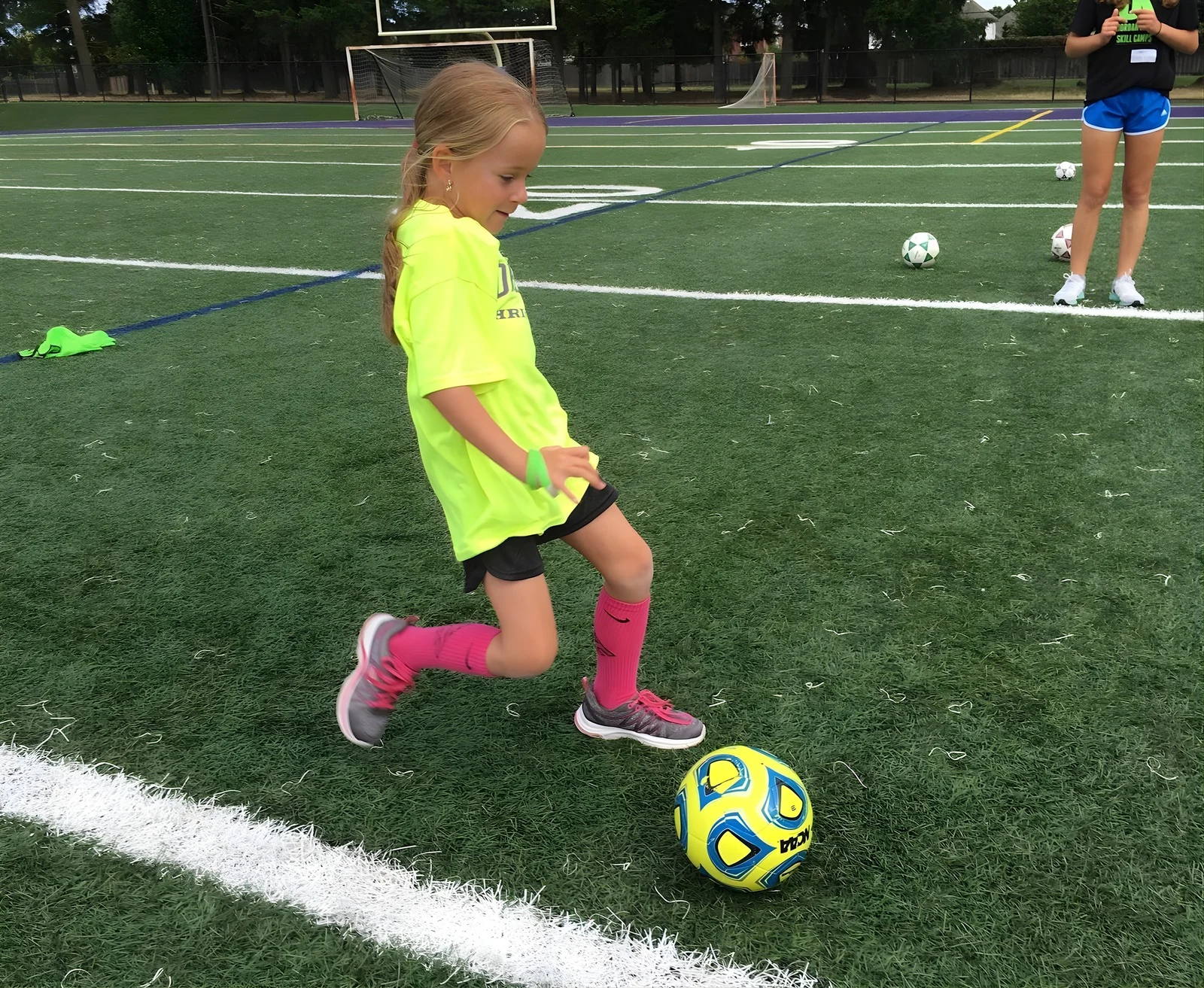
A camper practices soccer with the ball in view.

Try.

Keep the action understandable. Preserve the equipment and space to move.

Canva page 37
Jordan Kent and a camper meet hands in a high-five.

Connect.

Attention, encouragement and shared moments. The interaction is the story.

Canva page 31
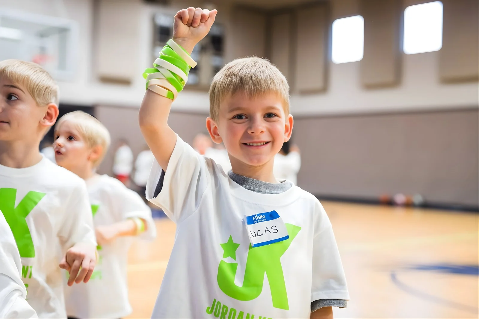
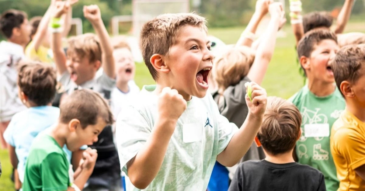
A camper smiles and raises an arm with lime wristbands.

Celebrate.

Small moments count. Show a real expression without inventing an outcome.

Canva page 33
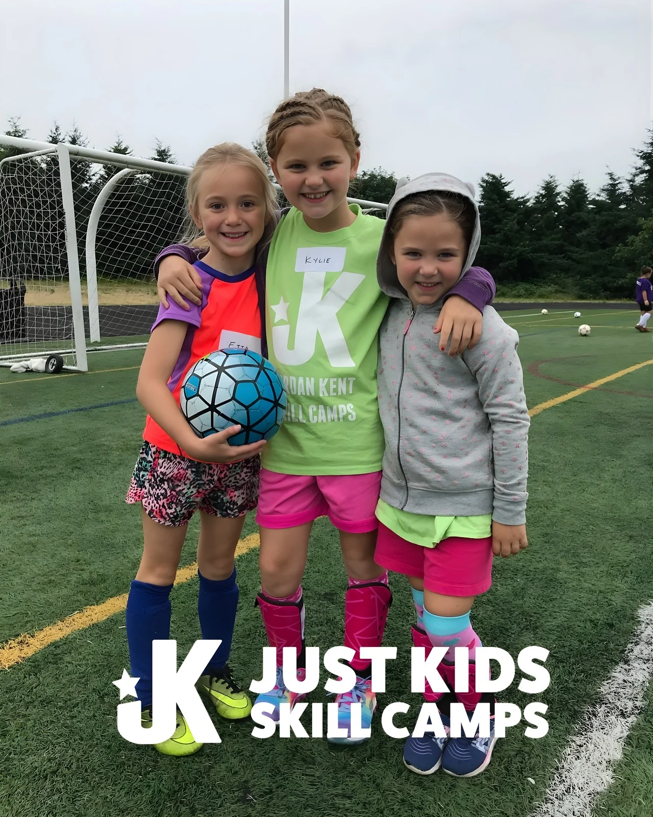
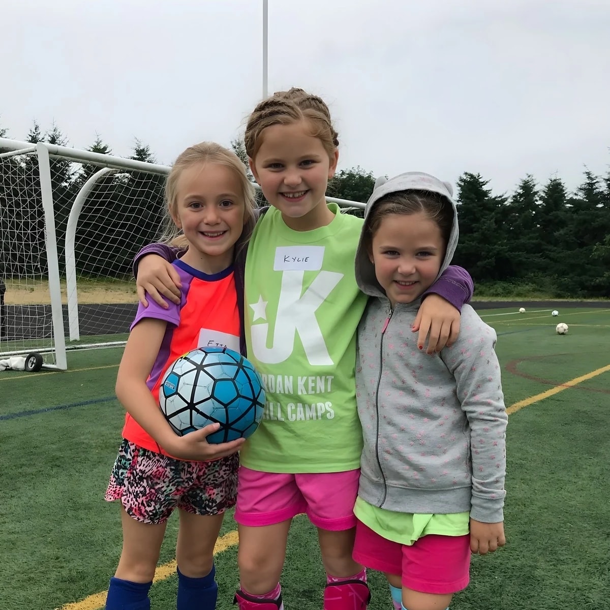
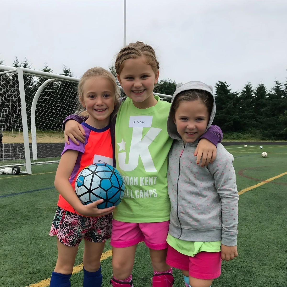
Three campers stand together with arms around shoulders and a soccer ball.

Belong.

Room to be yourself, and people to share it with. Keep the connection intact.

Canva page 39

Work with the image you have.

  • Good moment, enough detail: let photography lead.
  • Busy background or awkward crop: give text its own field.
  • Small or soft source: make the photo smaller and let type carry more.
  • No suitable image: make a deliberate photo-free announcement.

Keep it real.

  • Preserve faces, hands, equipment and meaningful context.
  • Use natural skin tones. Avoid heavy filters and artificial detail.
  • Do not generate campers, replace faces or invent events.
  • Check the delivered image at its final size. A large pixel count alone does not prove source quality.

The selected camp images are cleared by Matt for this JKSC guide and creative work. Capture dates are not recorded. Some available Canva files have prior upscaling; assess detail rather than assuming native camera resolution.

Explore the starter creative library →

06 / COMPOSITION

Made for the placement.

Real email headers, feed ads and campaign assets. Let the job determine the composition.

01 / MAILCHIMP

The everyday workhorse.

A header earns attention, then gives the email room to do its job. Two useful shapes, with the message integrated into the artwork.

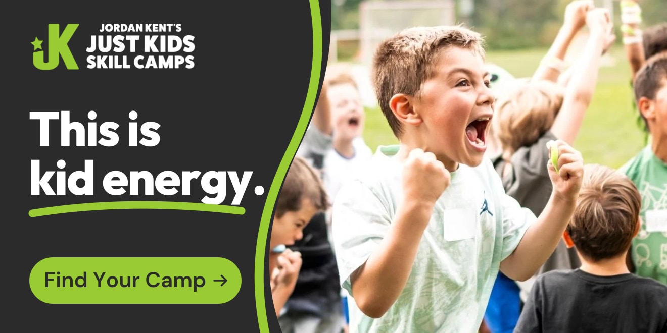
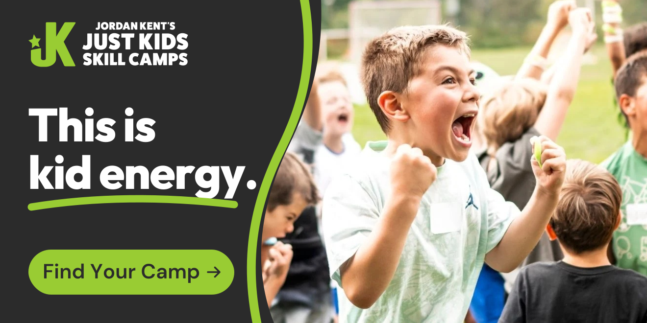
A camper cheers with raised fists. This is kid energy. Find Your Camp.
Hero with a clear next step1320 × 660 px · displays at 660 × 330 px
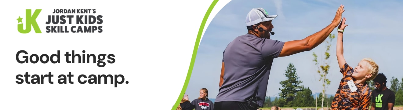
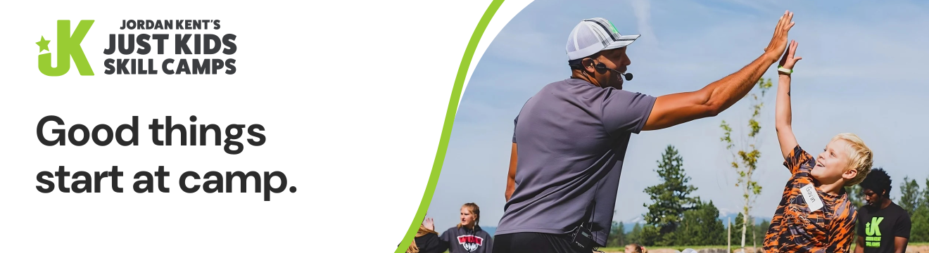
Good things start at camp. Jordan and a camper share a high-five beside a clear headline on white.
Compact header1320 × 360 px · displays at 660 × 180 px

Put the feeling in the image. The original hero keeps its energy and adds Find Your Camp. Link the entire image to the camp finder or relevant session.

Keep the useful details live. Repeat the action in a live Mailchimp button below the image. Keep location, dates and body copy live too, so the message still works when images are blocked.

See the compact header in an email →
02 / META / FEED + STORIES

Give parents a reason to care.

A candid camp moment, a parent-relevant invitation and enough context to understand the offer. Natural light stays part of the image.

For the kid who loves to move, and the kid trying a sport for the first time. Age-appropriate games, encouraging coaches, and room to try. Explore the camp experience.

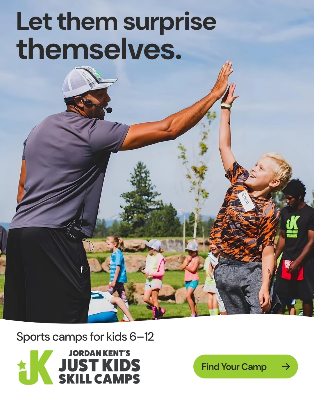
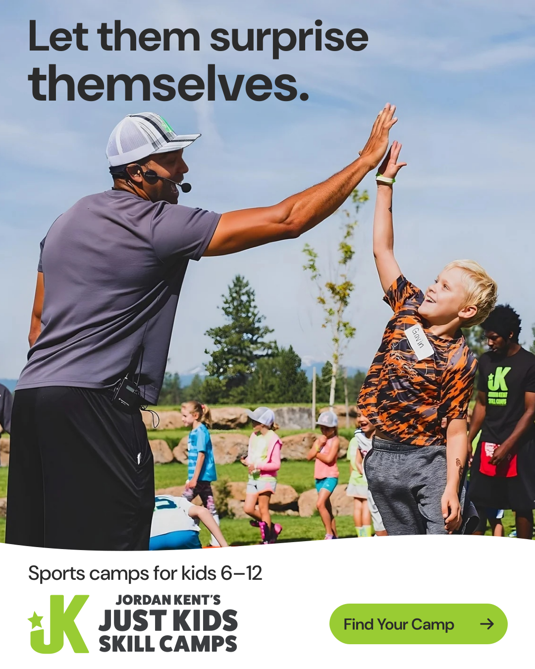
Jordan and a camper meet hands in a high-five. Let them surprise themselves. Sports camps for kids 6–12. Find Your Camp.
JORDANKENTCAMPS.COMSports camps for kids 6–12
Learn more
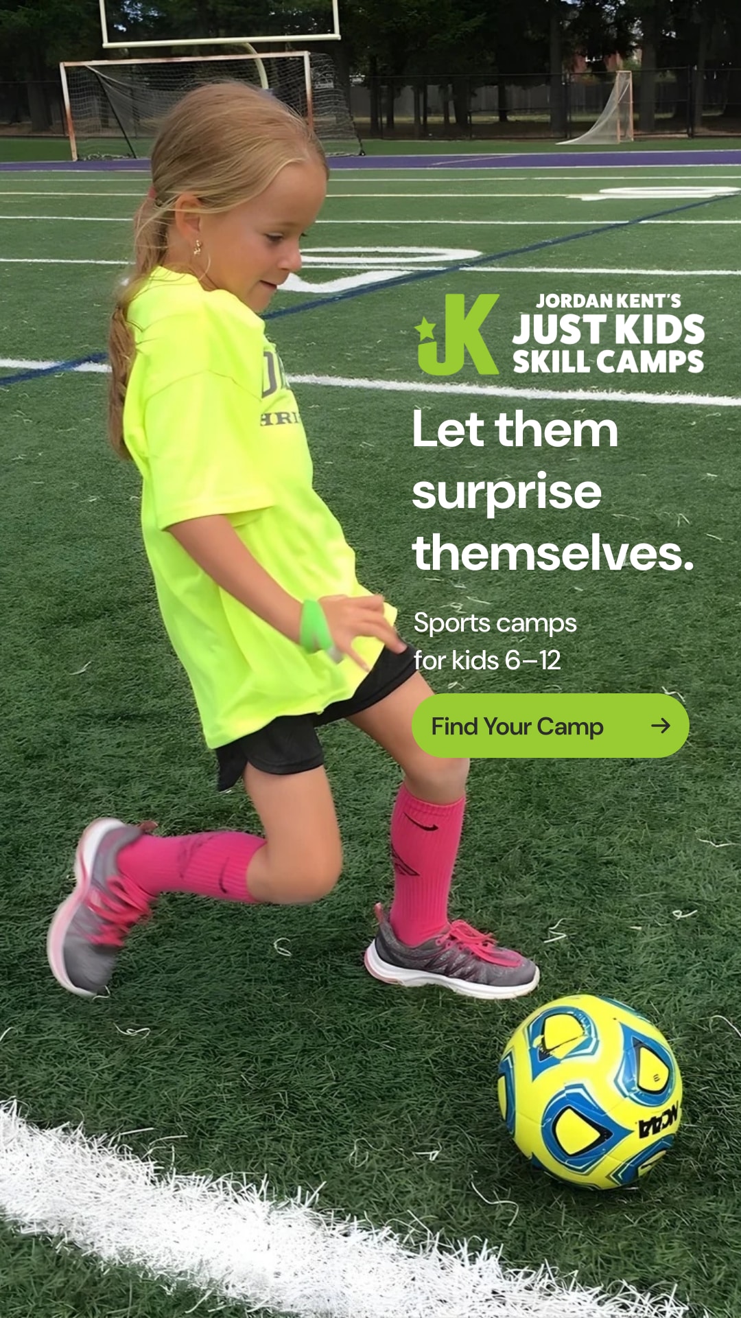
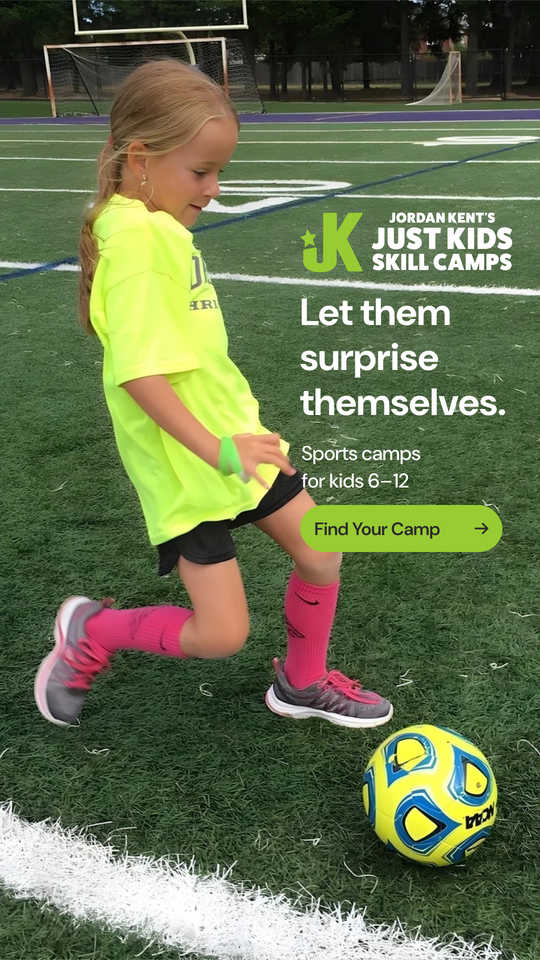
A camper practices soccer with her head, shoes and ball in view. Let them surprise themselves. Sports camps for kids 6–12. Find Your Camp.
Stories concept1080 × 1920 px · 9:16

Compose for the controls.

The vertical version uses a sport moment that fits the taller crop. The message, action and equipment stay clear of the placement’s interface.

Primary text and the native action shown at left sit outside the downloaded image. They are sample copy, not a live ad.

Complete the decision. The destination should make activities, coaching, dates, location, price and what is included easy to understand.

Portrait feed creative1080 × 1350 px · 4:5

These are 4:5 and 9:16 example canvases. Review each selected Facebook and Instagram placement in Ads Manager, including interface overlays, crops and automated enhancements. The 9:16 example is composed for Stories; check and adapt for Reels separately. The campaign copy illustrates a future registration message; it does not announce open registration.

03 / PERFORMANCE MAX

Give Google good ingredients.

A clean image set lets the camp moment travel across different ad layouts. Supply the name, logo, headlines and action as separate assets.

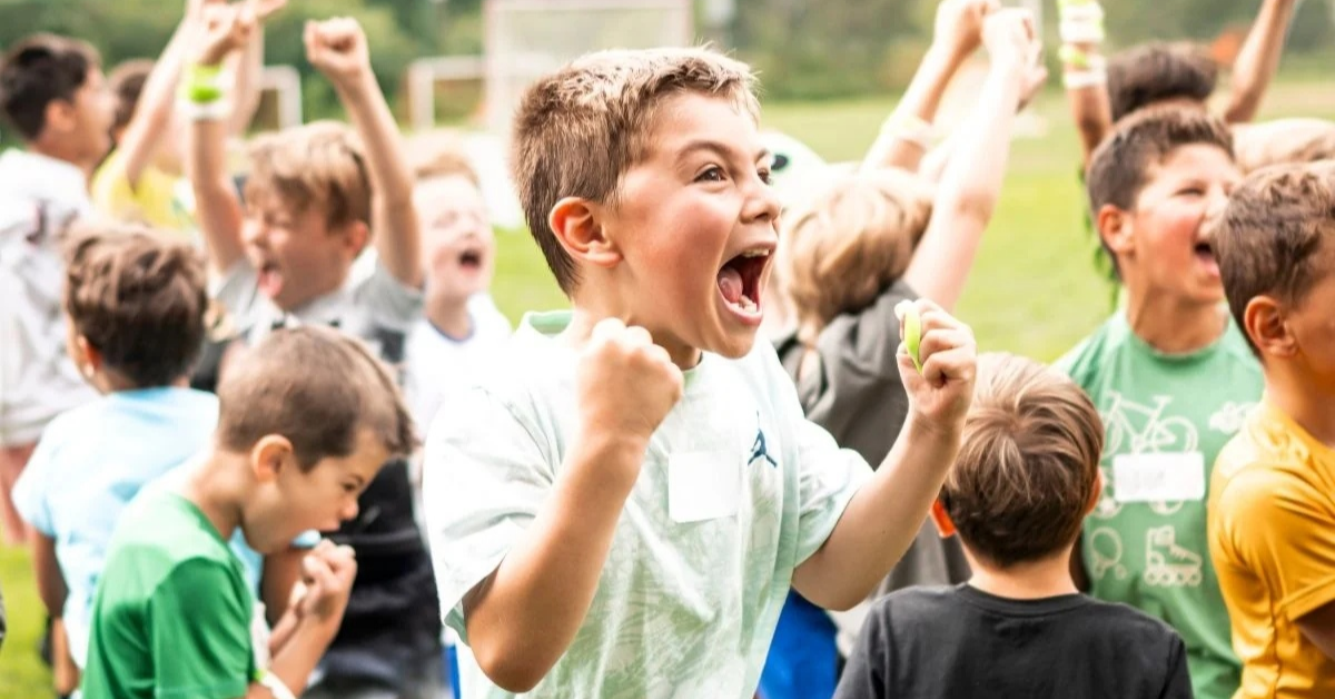
A camper cheers with raised fists while other campers celebrate behind.
Landscape image asset1200 × 628 px · approximately 1.91:1
Three campers smile together with arms around shoulders, one holding a blue soccer ball.
Square image asset1200 × 1200 px · 1:1
SEPARATE LOGO ASSETJordan Kent’s Just Kids Skill Camps
SAMPLE HEADLINES

Made for Kid Energy
Room to Try. Room to Belong.
Just Kids Skill Camps

SAMPLE DESCRIPTION

Sports, friends and room to try. Explore the Just Kids Skill Camps experience.

This is an illustrative asset set, not a complete campaign asset group. Google can combine and crop assets differently. Overlays are allowed, but Google recommends at least one image without overlays for each ratio. These clean versions provide that baseline.

Files you can actually start from.

The JPGs are separate channel assets. The SVGs preserve the editable layout with outlined lettering and embedded photographs. Import behavior varies by editor. Confirm current camp details, destinations and placement previews before use.

Download all six examples ↓

Production references: Mailchimp image recommendations · Email accessibility · Google PMax image guidance. The original photographs have limited detail and some prior upscaling. Export dimensions are canvas dimensions, not a claim about native camera resolution.

07 / VOICE

Sound like someone
who knows camp.

Realistic edits for the messages families actually receive.

Registration

Before

Register now for our amazing camps!

After

Choose your location, review the dates and activities, then register for the session that fits.

Tell families what to do and what they will find.

Schedule change

Before

Important update: camp details have changed.

After

Camp now starts at [new time] on [date]. Drop-off is at [location]. Here is what to do next: [action].

Replace brackets with confirmed details before sending.

New to camp

Before

Our camp is perfect for every child.

After

New to the game? There’s room to try. Check the activities and age range to find the right session.

Welcome people without promising a universal fit.

Availability

Before

Spots are filling fast!

After

Registration is open for [session]. View current availability and camp details.

Use urgency only when a current, verifiable fact supports it.

Warm, specific and useful.

Speak to parents with clarity and respect. Let kids feel welcome. Encourage the next try, explain logistics calmly, and give people one clear next action. Avoid guilt, invented urgency and guarantees of confidence or performance.

Campaign options: Made for kid energy. • Sports. Friends. Room to be yourself. • Go for it. These are flexible phrases, not mandatory taglines.

08 / IN CONTEXT

The image opens.
The email follows through.

A compact header leaves room for the information families need.

09 / HERITAGE

A little history.

Just Kids Skill CampsSince 2012

Part of the camp story. Use “Since 2012” as supporting copy on a camp promotion, an about page or a footer. Keep it secondary to the camp message and logo.

Do not attach it permanently to the logo. A numbered season and elapsed years are different measures. Confirm the season count and exact anniversary before using a numbered anniversary claim.

10 / CREATIVE LIBRARY

Find the moment.
Then find its format.

A searchable starting point for the assets already available.

Open the creative library ↗

Small now. Useful later.

Five photo records, the complete logo family, three logo options, 32 icons and six downloadable channel executions. Search by moment, sport or description. Filter by asset type.

Future records can carry capture date, source location, usage approval, crop guidance, file quality and related finished creative. This starter is a working index, not a complete archive or upload system.

11 / Accessible by design

Clear is part of the brand.

Make it easy to use.

  • Use charcoal or black text on lime and pink. Use black on orange and blue. White on lime or pink is not readable enough for meaningful text.
  • Maintain at least 4.5:1 contrast for normal text and 3:1 for qualifying large text. Essential interface graphics need 3:1 contrast.
  • Keep information available without color alone. Pair a color cue with wording or a recognizable symbol.
  • Keep essential body copy live and selectable when the format supports it.
  • Write useful alt text describing the real action or information. Decorative graphics can be marked decorative.
  • Use descriptive link labels and visible keyboard focus. Make controls comfortable to tap.
  • Check the smallest screen and the intended print size before release.

Before it goes out.

  • The name and logo are correct.
  • The lime is #99cc33.
  • The chosen font roles are correct.
  • The kid or message is the focus.
  • The crop and source resolution support the format.
  • Text and actions are readable.
  • All factual details and destinations are current.
  • The required asset permissions cover this use.

Read the asset at its real size. A beautiful full-screen preview does not prove a mobile ad, printed flyer or shirt will work.

Accessibility reference: W3C WCAG 2.2 quick reference.

12 / DOWNLOADS

Make something good.

The updated brand guide

Version 1.6. The complete working review guide, expanded with the icon family, usage rules and website placement examples.

Download PDF ↓

Logo and design library

All 13 original arrangements, three new review options, exports, styles and font source records.

Download assets ↓

Icon system

32 vector symbols, three color treatments, PNG fallbacks and the Skills in motion badge.

Download icons ↓

Campaign examples

Six Mailchimp, Meta and PMax exports with editable SVG layouts and production notes.

Download examples ↓

Vector masters

SVG and vector PDF files for design and production.

Download masters ↓

Working review edition, November 2, 2026. Direction developed by Matt. The new logo options are for comparison; this edition does not record Jordan’s final review. These files support authorized JKSC creative work. Font files remain subject to their respective licenses. Photo masters are not included in the downloadable logo packages.